
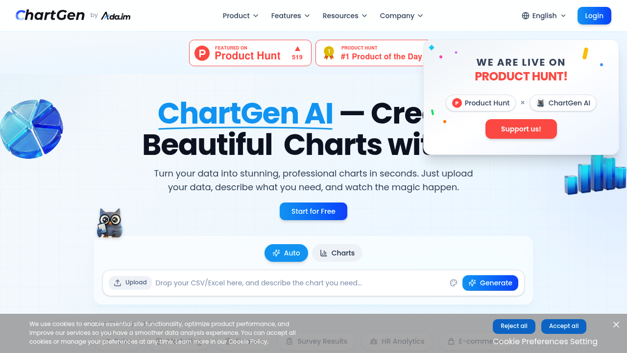
You describe what you want in plain English and ChartGen spits out a professional chart. No dragging data around spreadsheet cells. No wrestling with chart wizards. Just type something like "show quarterly sales by region as a bar chart" and you'll have publication-ready visuals in under five seconds.
ChartGen handles bar charts. Line graphs. Pie charts. Scatter plots. Also covers more specialized formats like heatmaps, funnel charts, and waterfall diagrams. Over 50,000 users have created more than 2 million charts — which suggests it's doing something right.
A marketing analyst preparing monthly performance reports could upload an Excel file and generate multiple chart variations without touching a single formula. ChartGen connects to databases and other data sources beyond basic file uploads. Charts update automatically when your underlying data changes.
Export options include PNG, SVG, and PDF formats.
The natural language approach won't replace every visualization need, especially for complex analytical work that requires fine-tuned control. ChartGen targets business teams who need decent-looking charts quickly rather than data scientists building custom dashboards. Enterprise customers get SOC 2 compliance and end-to-end encryption, which explains why 1,200+ companies use it across 110 countries. The 4.8 rating on G2 backs up the user satisfaction claims. There's a free plan to test things out before committing to paid features.