
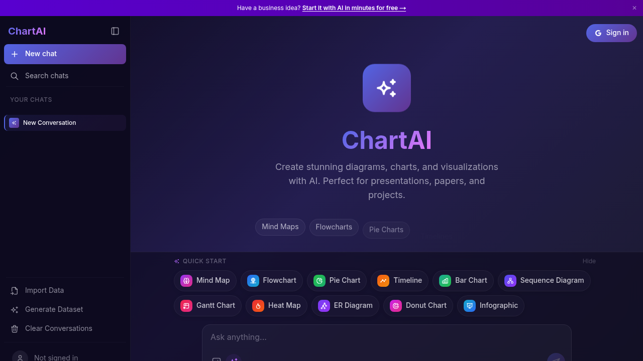
You land on Chartai and see a grid of quick start templates spanning eleven different visualization types. Mind maps, flowcharts, pie charts, timelines, bar charts, sequence diagrams, Gantt charts, heat maps, ER diagrams, donut charts, and infographics all sit ready to go. Pick one and you're in.
The interface lets you either import your own data or generate a dataset from scratch using AI. This matters when you're staring at a blank presentation deck at 11pm. You describe what you need visualized and Chartai builds it out. No wrestling with axis labels or color schemes.
The output quality varies. Sometimes you get exactly what you pictured. Other times the AI misinterprets your prompt and you're tweaking until it clicks. Chartai itself warns that it can make mistakes and suggests double-checking anything important. That's honest but frustrating when you're on deadline.
The community gallery shows what other people have created, which helps when you're stuck on how to structure something complex. You can browse examples of different diagram types to get ideas before building your own.
The range of chart types covers most presentation needs. Gantt charts for project timelines. Sequence diagrams for technical documentation. Heat maps for data density. ER diagrams for database planning. You're not hunting through five different tools to cover different visualization styles.
Where it stumbles is accuracy under pressure. The AI generation works best when you're specific and patient. Rush it with vague instructions and you'll spend more time fixing than if you'd built it manually. For polished work that matters, you'll want to verify every data point Chartai generates or visualizes.